When I first launched SPM Chat, I was basically flying blind. The only feedback I had was students yelling at me in a group chat. That works for catching bugs, but it doesn’t tell you if the product is actually working.
So I did what any reasonable person would do – I built a whole admin dashboard. Was it overkill for a hobby project? Probably. Do I check it every single day now? Also yes.
What I track
3 layers:
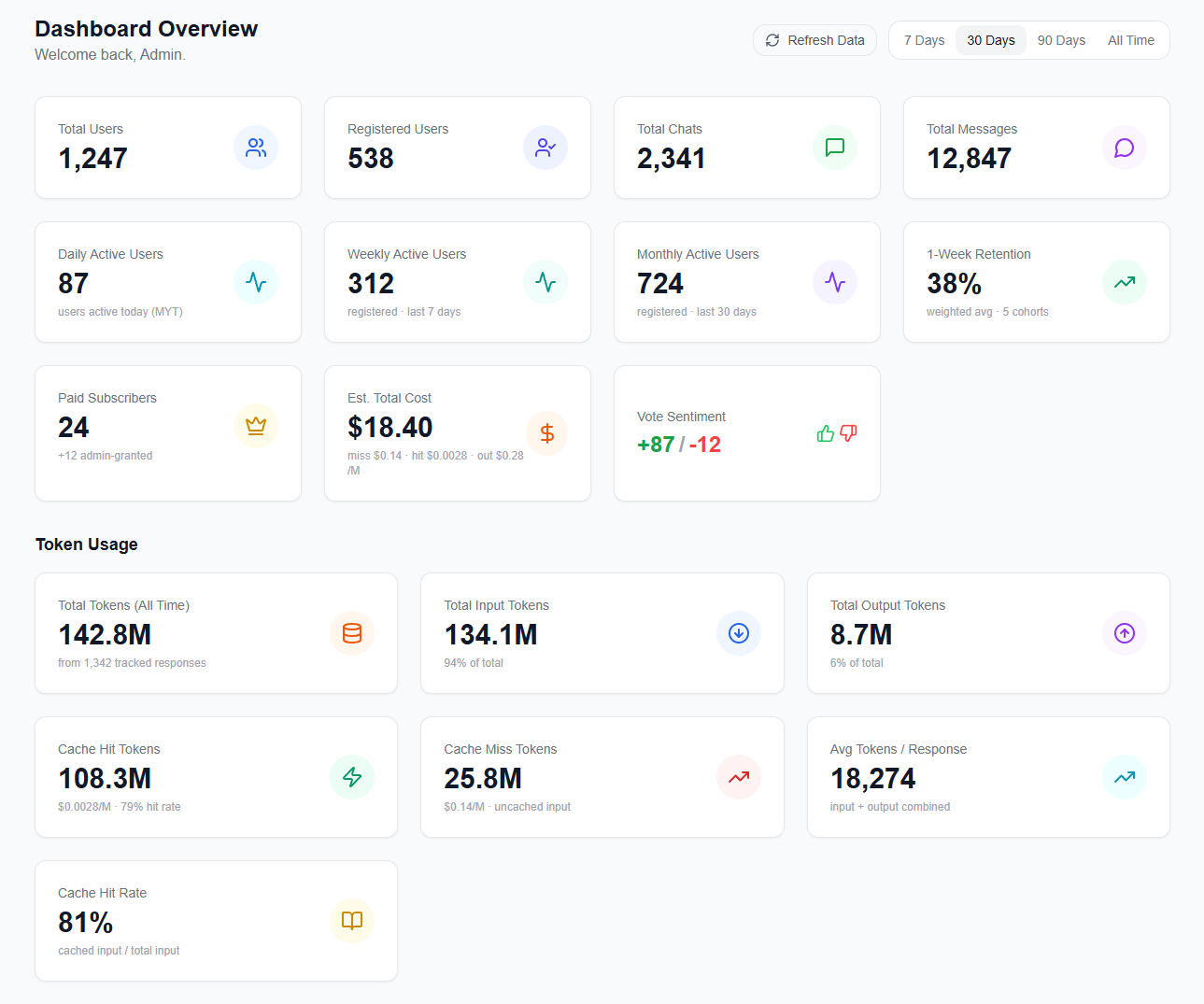
Users – daily, weekly, monthly active users, retention cohorts, streak leaderboard. Total user count feels good to look at, but honestly it’s a vanity metric. What actually matters is whether students come back.
Cost – token usage broken down by cache hits vs misses, estimated cost over time. SPM Chat runs on affordable models, so the margin between “sustainable hobby project” and “I need to shut this down” is pretty thin. When the cache hit rate drops, cost goes up dramatically. I need to see this before it becomes a problem.
Engagement – vote sentiment (thumbs up vs down), subject distribution, messages per chat, subject-by-form matrix. These tell me which subjects students are actually using, and whether the answers are good enough.
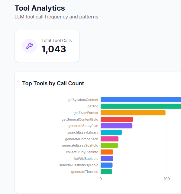
I also track which AI tools are being called most frequently. Turns out syllabus content lookups dominate, followed by table of contents and exam format queries. This basically tells me where students need better context.
Trends > exact numbers
I don’t care about the exact numbers as much as the direction.
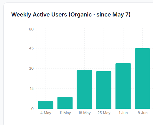
For example, after a major update that added blog posts, past year papers, and a smarter AI pipeline, the weekly active users shot up. Like, noticeably. That kind of signal is way more useful than knowing the absolute count – it tells me the update actually mattered to students.
On the flip side, the retention chart humbled me. It’s easy to feel good when total user count keeps climbing. But the dashboard showed me that a lot of students try the app once and don’t come back. Without that chart, I would have been celebrating growth while ignoring a leaky bucket. (Not a great feeling, but better to know than not know.)
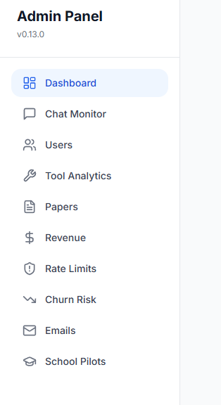
It’s also a control panel
This is the part I didn’t expect to be so useful. The dashboard is not just analytics – it doubles as an admin tool. I built control panels directly into it:
- Granting trial pro accounts to students who give detailed feedback
- Running school pilot programmes, onboarding a whole class and monitoring their usage
- Inspecting individual chat histories to understand where the AI gives bad answers
- Analyzing subject-by-form usage to decide what content to prioritize next
The chat monitor is probably my favourite part. I can see exactly how the AI responds to a student – including token costs, tool calls, cache hit rates per message. When a student reports a bad answer, I just pull up the exact conversation and figure out what went wrong. No more guessing.
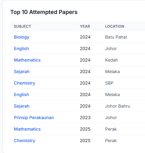
I can also see which past year papers students are attempting most, which helps me prioritize sourcing and formatting new papers.
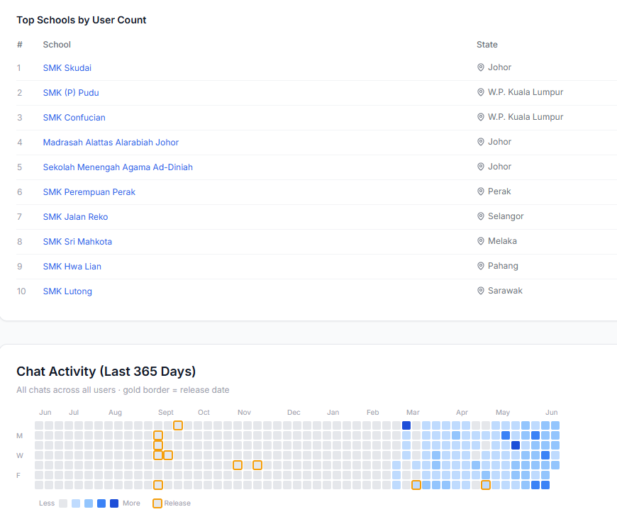
And for the school pilot programme, the dashboard tracks which schools are represented, along with a chat activity heatmap that shows usage patterns over the past year. You can see activity picking up around September (when SPM Chat first launched) and then accelerating after the v0.10 update in May.
No more digging through the database
Before I had the dashboard, checking anything meant SSH-ing into the server, writing SQL queries, trying to remember which table stores what. It was slow, I only did it when something already felt wrong, and half the time I’d mess up the query.
Now I just open a browser – on my phone, on my laptop, anywhere – and within seconds I know how the app is doing. I check it every day, sometimes multiple times a day. It became a habit, and that habit is what lets me catch problems early instead of reacting to fires. (TBH it’s also a bit addictive.)
You should build one too
I wish I had built this from day one. In the early days, I was making decisions based on vibes – what students said in the group chat, what I personally thought was important, what felt right. The dashboard replaced vibes with data.
And here’s the thing – with AI coding tools like Claude Code and Codex, building a dashboard like this is way easier than it used to be. Most of the dashboard pages you see here were built with Claude Code in a single session. You describe what you want to track, point it at your database schema, and it generates the queries, the API routes, the UI components. If you’ve been putting off building a dashboard because it feels like a lot of work, it really isn’t anymore.
It doesn’t have to be fancy. My first version was just a few SQL queries. The important thing is having a place where you can check, at a glance, whether things are getting better or worse.